The “Responsive” Lie: Why You Are Losing Money
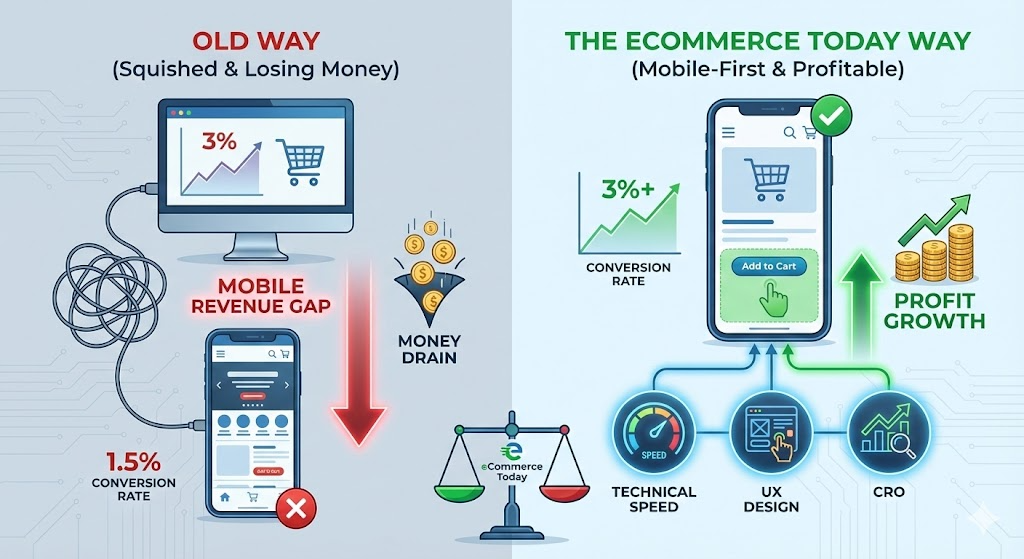
Let’s look at the hard data. Open your Shopify Analytics. Filter by “Device.”
If you are like most brands in 2026, your dashboard looks something like this:
- Desktop Conversion Rate: 3.5%
- Mobile Conversion Rate: 1.2%
This is what we call the Mobile Revenue Gap.
For years, theme developers sold us on the idea of “Responsive Design.” They claimed that as long as the website “squished” to fit a smartphone screen, the job was done. In 2026, that is a dangerous lie.
“Responsive” just means the content fits. It does not mean the content converts. With Customer Acquisition Costs (CAC) on Meta and TikTok reaching all-time highs, you are paying a premium for traffic. If 80% of that traffic is on mobile, and your mobile site converts at half the rate of your desktop site, you are lighting 40% of your ad spend on fire.
At eCommerce Today, we don’t treat mobile optimization as a “design tweak.” We treat it as a tripartite system of Technical Speed, UX Psychology, and CRO Strategy.
📱 TL;DR: The Mobile-First Mandate
- Traffic vs. Conversion: Mobile typically accounts for 70% of traffic, yet often lags in conversion; closing this gap is the primary lever for growth.
- Technical Edge: Success in 2026 demands a focus on Core Web Vitals—specifically Interaction to Next Paint (INP)—to ensure a seamless user experience.
- UX Precision: Implement Thumb-Zone Navigation and friction-free, simplified checkout flows to meet the expectations of on-the-go shoppers.
- Strategic Shift: Brands must move beyond "responsive design" and adopt a "mobile-first" operating system to optimize performance and protect profit margins.
- Action: Audit your Shopify mobile UX against our 2026 performance benchmarks to transition from "Responsive" to "Revenue-Ready."
Why this matters for Shopify brands:
At eCommerce Today, we focus on turning stores into high-performing assets

Here is the exact audit framework we use for our Managed Services clients to close the gap.
1. Speed is a Feature (Core Web Vitals)
Google’s 2026 algorithms prioritize Interaction to Next Paint (INP). This measures how quickly your site reacts when a user taps a button.
- The Problem: Heavy apps and unoptimized images make the site feel “sticky” or slow.
- The Fix: We implement lazy loading and compress assets using tools referenced in our [Shopify Image Optimization Guide].
- Business Impact: A 0.1-second improvement in mobile site speed can increase conversion rates by 8%.
- Speed is a Feature (Core Web Vitals)
In the old days (2023), we obsessed over “Largest Contentful Paint” (how fast the banner loads). In 2026, Google’s algorithms and user patience have shifted to Interaction to Next Paint (INP).
The Problem: Have you ever tapped “Add to Cart” on a mobile site and… nothing happened for a second? So you tapped it again? And then suddenly two items appeared in the cart? That is poor INP. Mobile devices have weaker processors than desktops. When your Shopify store is bloated with 30 apps, heavy JavaScript, and unoptimized tracking pixels, the phone’s CPU gets clogged. The site feels “sticky” or “sluggish.”
The Fix:
- Javascript Minimization: We audit your app list. If an app isn’t driving revenue, it shouldn’t be loading a script.
- Facade Loading: For third-party chats (like Gorgias) or reviews (like Loox), we use “facade” loading. This means the heavy code only loads after the user interacts with the widget, not on initial page load.
- Asset Compression: We force all images into AVIF or WebP formats, which are 30% smaller than JPGs without quality loss.
Business Impact: Walmart and Amazon data confirm that a 0.1-second improvement in mobile site speed translates to an 8% increase in conversion rates. Speed isn’t tech; speed is revenue.
- The “Thumb Zone” Architecture
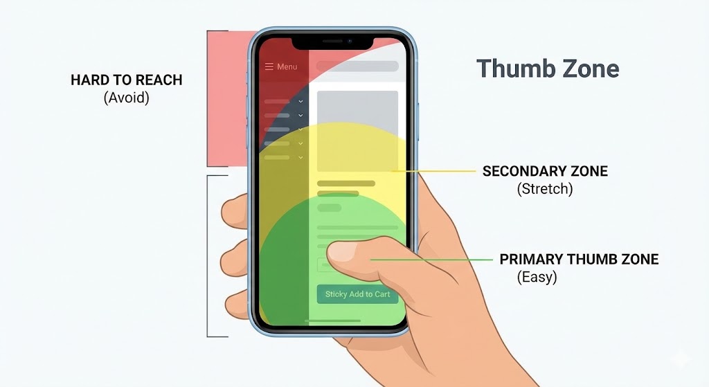
Take your phone out right now. Hold it in one hand. Where is your thumb? It is likely resting in the bottom-center of the screen.
Now, look at your current mobile site.
- Is the Menu button in the top left? (The “Red Zone” – hard to reach).
- Is the Cart icon in the top right? (The “Stretch Zone”).
If you force users to use two hands or perform “thumb gymnastics” to navigate your store, friction goes up, and conversion goes down.
The Fix:
- Sticky Bottom Bars: We code custom sticky bars that keep the primary action—usually “Add to Cart”—anchored to the bottom of the screen. As the user scrolls through the product description, the button is always under their thumb.
- Tabbed Navigation: Instead of a complex “Hamburger Menu” that opens a tiny list, we use slide-out drawers with large, tappable touch targets (minimum 44×44 pixels).
Gestures over Clicks: In 2026, users expect to swipe. Product galleries must be swipeable. Carts should be swipe-to-remove. If it requires a precision tap, it’s wrong.

- Content Hierarchy: Stop the “Wall of Text.”
On a 27-inch desktop monitor, a 5-line paragraph looks elegant. On an iPhone 16, that same paragraph looks like a college textbook. Mobile users do not read; they scan. If they see a wall of text, they bounce.
The Fix:
- The Accordion Strategy: For Product Detail Pages (PDP), we hide the heavy technical specs, shipping info, and returns policy behind expandable “accordion” tabs. This keeps the page short visually but keeps the information accessible.
- Font Sizing: We standardize body text to a minimum of 16px (often 18px). If a user has to “pinch to zoom” to read your ingredients list, you have failed.
- Visual Breaks: We never allow more than three lines of text without a visual interruption—an icon, a bullet point, or a lifestyle image.
- Pop-ups and the “Google Penalty.”
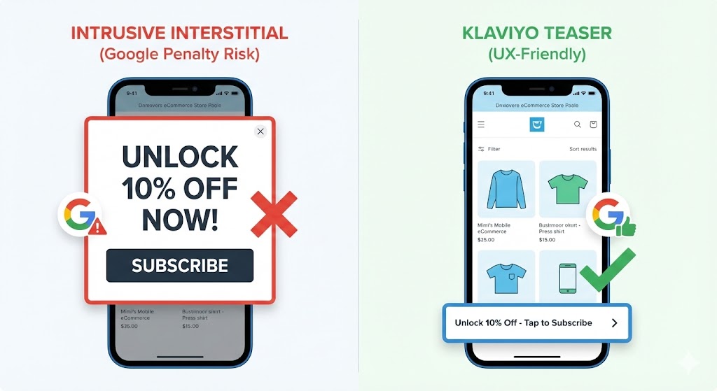
Nothing kills a mobile session faster than landing on a site and immediately being slapped with a full-screen pop-up: “WAIT! UNLOCK 10% OFF!” Usually, the “X” button is microscopic, or worse, off the screen entirely.
The Risk: Google actively penalizes sites with “intrusive interstitials” on mobile. If your popup covers the main content immediately upon load, your SEO rankings will suffer.
The Solution: We don’t kill list building; we make it polite.
- Teasers: We configure Klaviyo forms to appear as a small “gift box” icon floating in the corner. It only expands when the user taps it.
- Scroll-Based Triggers: We delay pop-ups until the user has scrolled 50% of the page or spent 20 seconds on the site. This ensures they are actually interested before we ask for an email.
- Bottom Sheets: Instead of center-screen modals, we use “bottom sheets” (like a native app menu) that slide up from the bottom, taking up only 30% of the screen.

5. Checkout Extensibility & Digital Wallets
The “Add to Cart” is not the finish line. The Checkout is. Entering a 16-digit credit card number on a mobile keyboard while riding the subway is a nightmare. It is the #1 cause of cart abandonment.
The Fix: With Shopify Checkout Extensibility, we streamline the payment process to be effectively “one tap.”
- Digital Wallets First: Apple Pay, Google Pay, and Shop Pay must be visible at the top of the checkout, not just as options at the end.
- Trust Signals: We move security badges and “Free Returns” guarantees to sit directly underneath the “Pay Now” button. On mobile, reassurance needs to be visual and immediate.
- Auto-Fill Validation: We ensure address forms use rigorous auto-fill logic so users don’t get error messages for typos in their zip code.
6. Search is the New Navigation
On desktop, users might browse through “Men > Tops > T-Shirts.” On mobile, they just want to search. If your mobile search bar is hidden inside a menu, you are losing sales.
The Fix:
- Exposed Search: We often place a full-width search bar at the very top of the mobile header.
- Predictive AI Search: We use tools (often native Shopify or apps like Search & Discovery) to show results as the user types, including thumbnail images.
- Visual Filters: When a user searches for “shoes,” the filters for size and color should be large, tappable buttons, not tiny dropdown lists.
The “Fractional Team” Advantage
You might be thinking, “I’ll just ask my developer to fix this.”
Here is the reality:
- A Developer can minify the code, but they don’t know where to place the “Add to Cart” button for maximum psychology.
- A Designer can make it look pretty, but they might use high-res images that kill your page load speed.
- A Marketer can write the popup copy, but they might trigger it too early and kill your SEO.
Mobile optimization is not a task; it is a system.
This is why the eCommerce Today Managed Services model works. You don’t get a freelancer guessing at the solution. You get a Technical Lead auditing the code, a CRO Specialist designing the layout, and an Account Manager ensuring it aligns with your Q1 revenue goals.
We close the Revenue Gap by treating your mobile site as your primary flagship store—because in 2026, that is exactly what it is.
Frequently Asked Questions
Q: Why is my Shopify store slow on mobile?
A: Mobile slowness is usually caused by large, uncompressed images, too many third-party apps loading scripts in the background, or an outdated theme code. Fixing this requires a technical audit of your Core Web Vitals.
Q: What is the ideal mobile conversion rate for Shopify?
A: While it varies by industry, a healthy mobile conversion rate in 2026 is typically between 1.5% and 2.5%. If you are below 1%, you likely have friction in your UX or checkout flow.
Q: How do I turn off pop-ups on mobile only in Shopify?
A: Inside your email marketing tool (like Klaviyo), you can configure display settings to “Desktop Only” or create a specific, smaller mobile version that complies with Google’s intrusive interstitial guidelines.
Q: Does Shopify automatically optimize for mobile?
A: Shopify themes are responsive (they fit the screen), but they are not fully optimized for conversion. True optimization requires custom coding for speed, sticky add-to-carts, and specific UX adjustments that standard themes don’t offer.
Q: What is the "Thumb Zone" in mobile design?
A: The Thumb Zone is the area of the screen a user can easily reach with their thumb while holding the phone with one hand. Important elements like “Add to Cart” or “Checkout” should always be placed in this zone (bottom of the screen).

