It might be time to give your retail space a much-needed makeover! In today’s highly competitive market, having a visually captivating and welcoming store can make all the difference in boosting sales and increasing customer satisfaction. Getting started with Shopify is easy and you can read more about that in our article on how to set up a Successful Shopify Store.
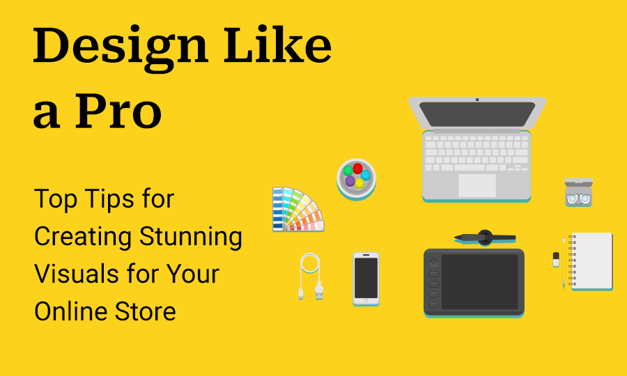
📱 TL;DR: Design Like a Pro
- Research & Structure:: Study industry competitors for inspiration and use a logical layout (Banner → Social Proof → Featured Products → About Us) to guide customers toward a purchase.
- Visual Professionalism: Use high-quality, crisp images from royalty-free sites like Pexels or Unsplash. Avoid grainy photos, which damage brand trust.
- Branding Consistency: Limit your palette to 2–3 colors and 2 fonts maximum. Consistency across all pages makes your brand recognizable and polished.
- The Power of Simplicity: Utilize white space (negative space) to prevent visual overwhelm and ensure your store is mobile-optimized for the growing number of phone-based shoppers.
- Unified Voice: Maintain a consistent tone of voice in your copy to build a personality that connects with your target audience. "
- Research your competition
The internet offers a wealth of inspiration, and taking the time to investigate various online stores within your industry can be incredibly beneficial. By studying what works for others, you can collect ideas and customize them to suit your distinct design style.
- Choose a clear structure for your store
By choosing a clear structure, you effectively guide your viewer through your store with the final destination: the products you sell. A good structure can include a main banner with clear text and a strong call to action, a testimonial section for building credibility, featured products, our product categories, about us section.
- Use High-Quality Images
High-quality images are essential to showcase your online store in the best light. It’s not just about your products – your website’s aesthetic is equally important. Blurry, grainy images give off amateur vibes, while crisp, bright visuals scream professionalism. Customers want to feel confident and secure when shopping with you – impress them with stunning visuals that radiate trustworthiness. Make sure your pictures are worth a thousand words.
Tools: Here are some online library websites for royalty-free images: https://pixabay.com/ , https://www.pexels.com/ or https://unsplash.com/
- Create brand consistency with colors and fonts
Imagine walking into a store where the walls are painted different colors, and each aisle has a different font. It’s like a visual assault on your senses! That’s why consistency is key to creating a strong brand identity. By sticking to the same color scheme (we recommend using 2-3 colors), typography (using 2 fonts is more than enough), and design elements throughout your store, you’ll make it easier for customers to recognize and remember your products. Plus, it’ll give your store a polished and professional look that will keep customers coming back for more. So, remember: Stick to your brand like glue!
Tools: Create color palettes https://coolors.co/ , choose fonts from Google Fonts, a library of 1490 open source font families https://fonts.google.com/
- Use white space
Did you know that leaving blank spaces in your design can actually make it look better? It’s true! White space, or negative space, can help create a more professional and visually pleasing design for your store. By using it wisely, you can make important elements stand out and ensure a perfect balance in your design. So don’t be afraid to embrace the power of white space!
- Optimize for Mobile Devices
Want to attract more customers to your online store? Make sure it’s mobile-responsive! With the rise of mobile shopping, it’s crucial to optimize your website for smaller screens. Ensure that your website has a clean layout that’s easy to navigate, uses high-quality images that load quickly, and makes clickable elements easy to tap with a finger. By optimizing for mobile, you’ll create a seamless and enjoyable shopping experience that keeps customers coming back for more, no matter where they are.
- Use a Consistent Tone of Voice
Your store’s voice is just as important as the images and graphics you use – it can make or break the way customers perceive your brand. That’s why it’s crucial to maintain a consistent tone throughout all of your store’s copy, whether it’s product descriptions, headlines, or calls to action. By using a tone that reflects your brand’s personality and values and resonates with your target audience, you can establish trust and make your customers feel at home while they shop. So take the time to develop a distinctive voice that will create a more cohesive, enjoyable shopping experience!
It’s important to keep in mind that the design of an online store should align with the target audience and brand identity, while also being adaptable to changing trends and consumer preferences. In addition, you can read more about how to build graphics for your Shopify store with Canva without the need for extensive design experience or software knowledge.
You don’t need to be a professional graphic designer to create a high-converting retail space. By focusing on intentional structure and visual clarity, you can build a professional brand that resonates with your customers.
- Research & Structure: Study industry competitors for inspiration and use a logical layout (Banner → Social Proof → Featured Products → About Us) to guide customers toward a purchase.
- Visual Professionalism: Use high-quality, crisp images from royalty-free sites like Pexels or Unsplash. Avoid grainy photos, which damage brand trust.
- Branding Consistency: Limit your palette to 2–3 colors and 2 fonts maximum. Consistency across all pages makes your brand recognizable and polished.
- The Power of Simplicity: Utilize white space (negative space) to prevent visual overwhelm and ensure your store is mobile-optimized for the growing number of phone-based shoppers.
- Unified Voice: Maintain a consistent tone of voice in your copy to build a personality that connects with your target audience.
The Bottom Line: A clean, cohesive, and mobile-friendly design is a direct investment in your store’s credibility and conversion rate.
Frequently Asked Questions
1. How can I create a professional store layout if I’m not a designer?
You don’t need advanced design skills to build a high-converting store. Focus on a logical visual hierarchy that guides the customer’s eye. A successful structure typically follows this flow: a high-impact main banner with a clear Call to Action (CTA), followed by social proof (testimonials), featured product collections, and finally, an “About Us” section to build brand personality.
2. What is "White Space" and why is it important for my sales?
White space, or negative space, is the empty area around your text and images. It prevents your store from looking cluttered or overwhelming. By using white space strategically, you allow your products to “breathe,” making important elements—like your “Buy Now” buttons—stand out more clearly, which improves the overall user experience and conversion rates.
3. How many colors and fonts should I use to keep my branding consistent?
To maintain a polished and professional look, the “less is more” rule applies. We recommend sticking to a palette of 2–3 colors and no more than 2 fonts. Using too many different styles can confuse customers and make your brand feel disjointed. Consistency across all pages helps customers recognize and remember your brand instantly.
4. Where can I find high-quality images without a professional photographer?
Visuals are the primary way customers judge your store’s trustworthiness. If you can’t take your own high-resolution photos, use royalty-free libraries like Unsplash, Pexels, or Pixabay. These sites offer professional, crisp imagery that avoids the amateur look of grainy or blurry photos.
5. Why is mobile optimization critical for my retail success?
With more people shopping on their phones than ever before, a mobile-responsive design is no longer optional. Mobile optimization involves ensuring images load quickly, layouts stack correctly on vertical screens, and clickable elements (like buttons and menus) are large enough to be easily tapped with a thumb.